

The Ocean Cleanup
A concept redesign of the world's largest cleanup operation's public dashboards — turning remarkable data buried in pages into numbers you can actually feel.
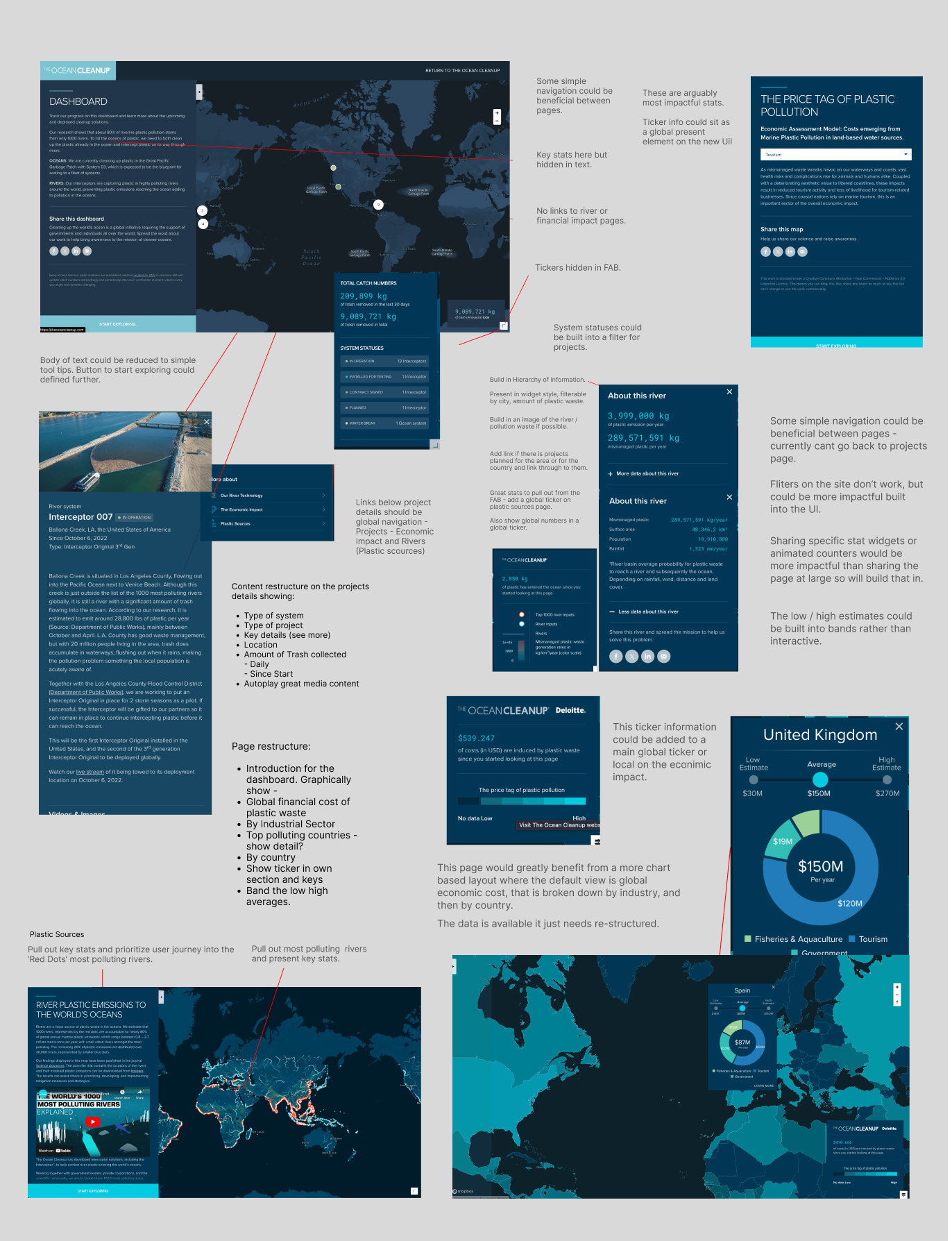
The Ocean Cleanup publishes live figures most organizations would kill for: interceptors catching hundreds of tonnes of plastic, river-by-river telemetry, a global economic model of what pollution costs. But in the live product that data sat scattered — tickers hidden in floating buttons, key stats buried in body text, no path between a project and its impact.
THE AUDIT
The work started as a full audit of the existing dashboard: every screen annotated, every dead end mapped. The findings were consistent — the content was world-class, the structure wasn't. Statuses could become filters, tickers could become bands, and the three stories (Projects, Economic Impact, River Sources) needed to be one navigable system instead of three separate pages.
THE SYSTEM
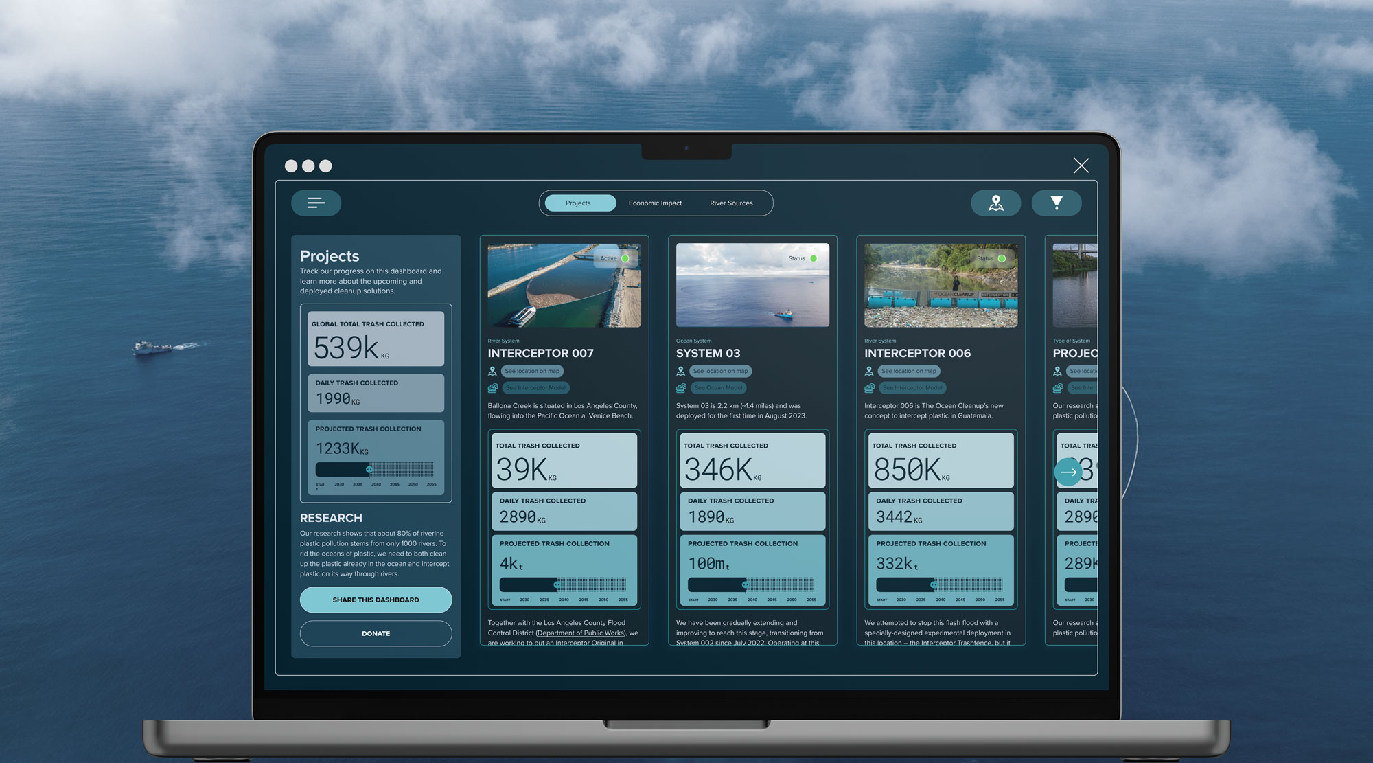
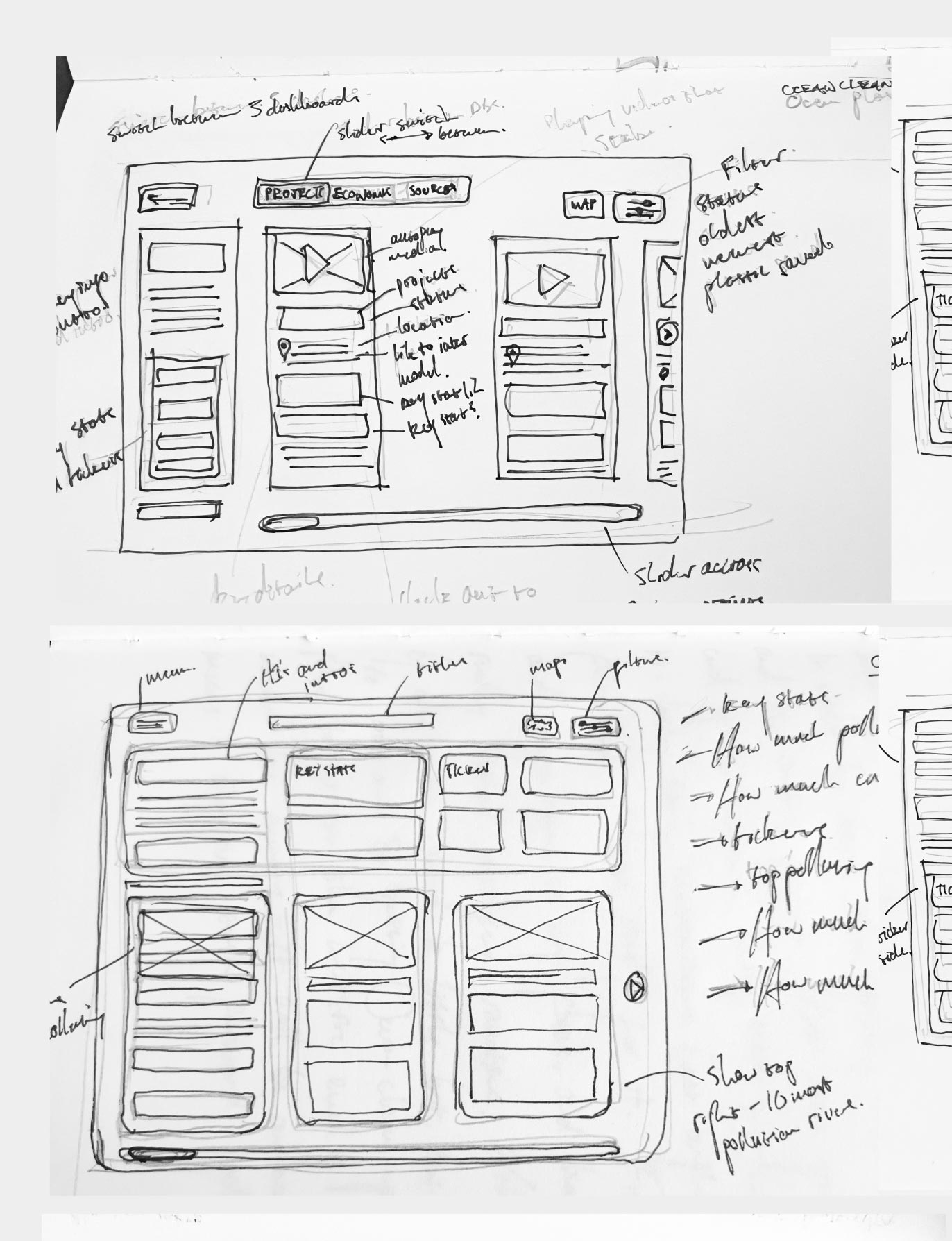
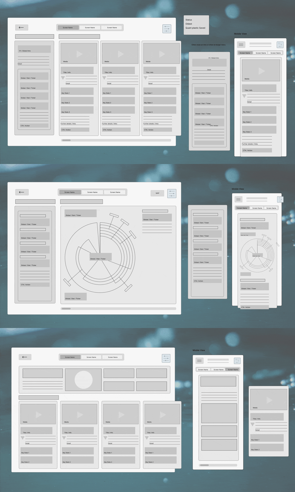
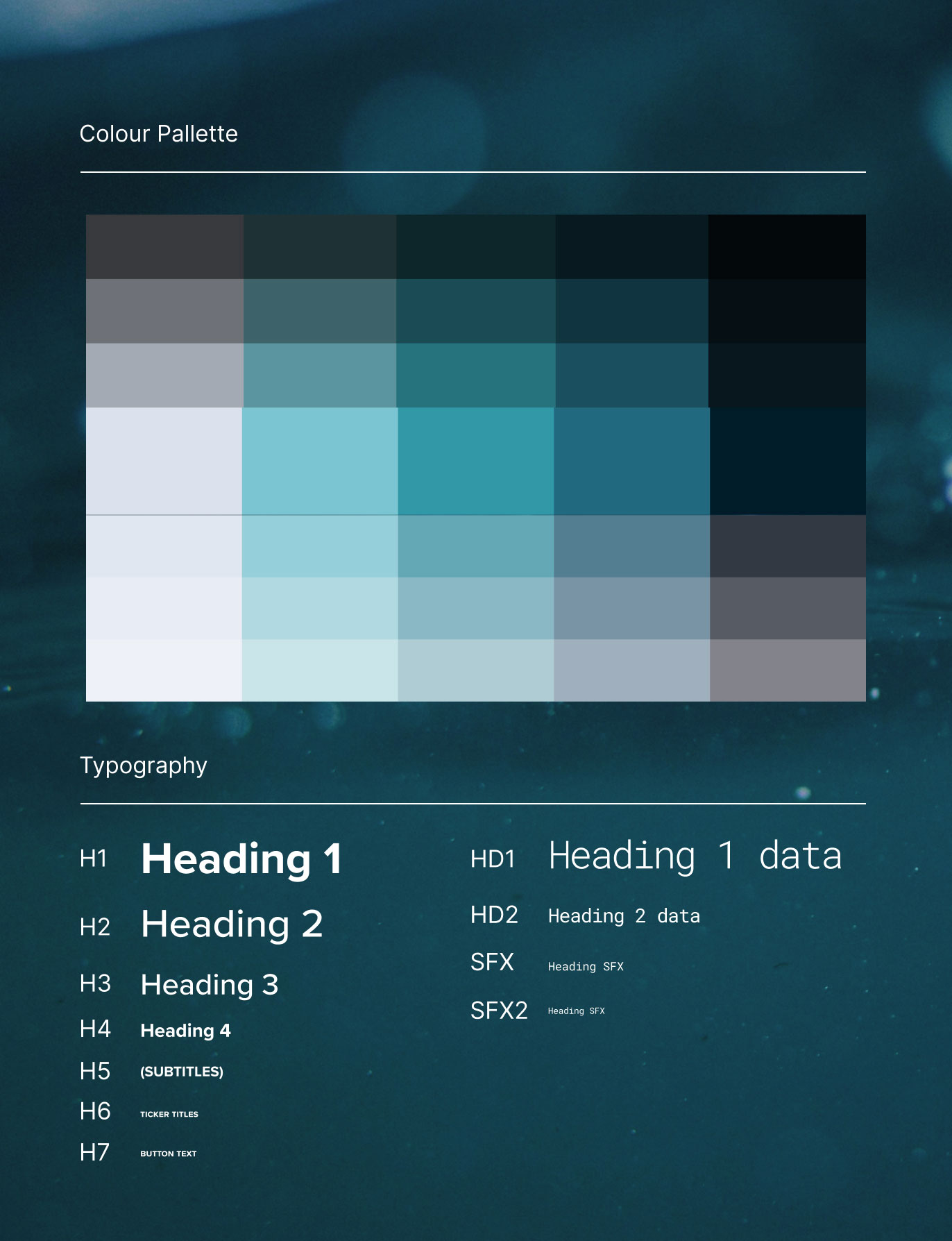
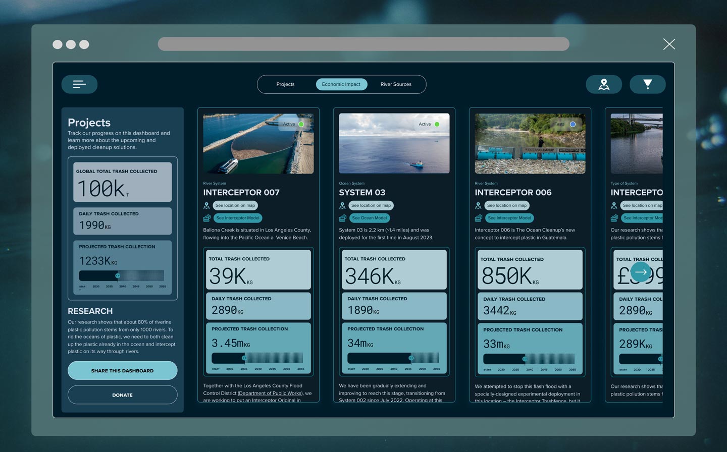
From sketches to animated wireframes, the redesign settles on a slider-deck structure: a global stats rail on the left, project cards with live catch tickers front and center, and one persistent navigation across the three dashboards. A deep-water palette sampled from the organization's own photography carries it, with a mono data face for the numbers so a ticker never reads like body copy.
EVERY SURFACE
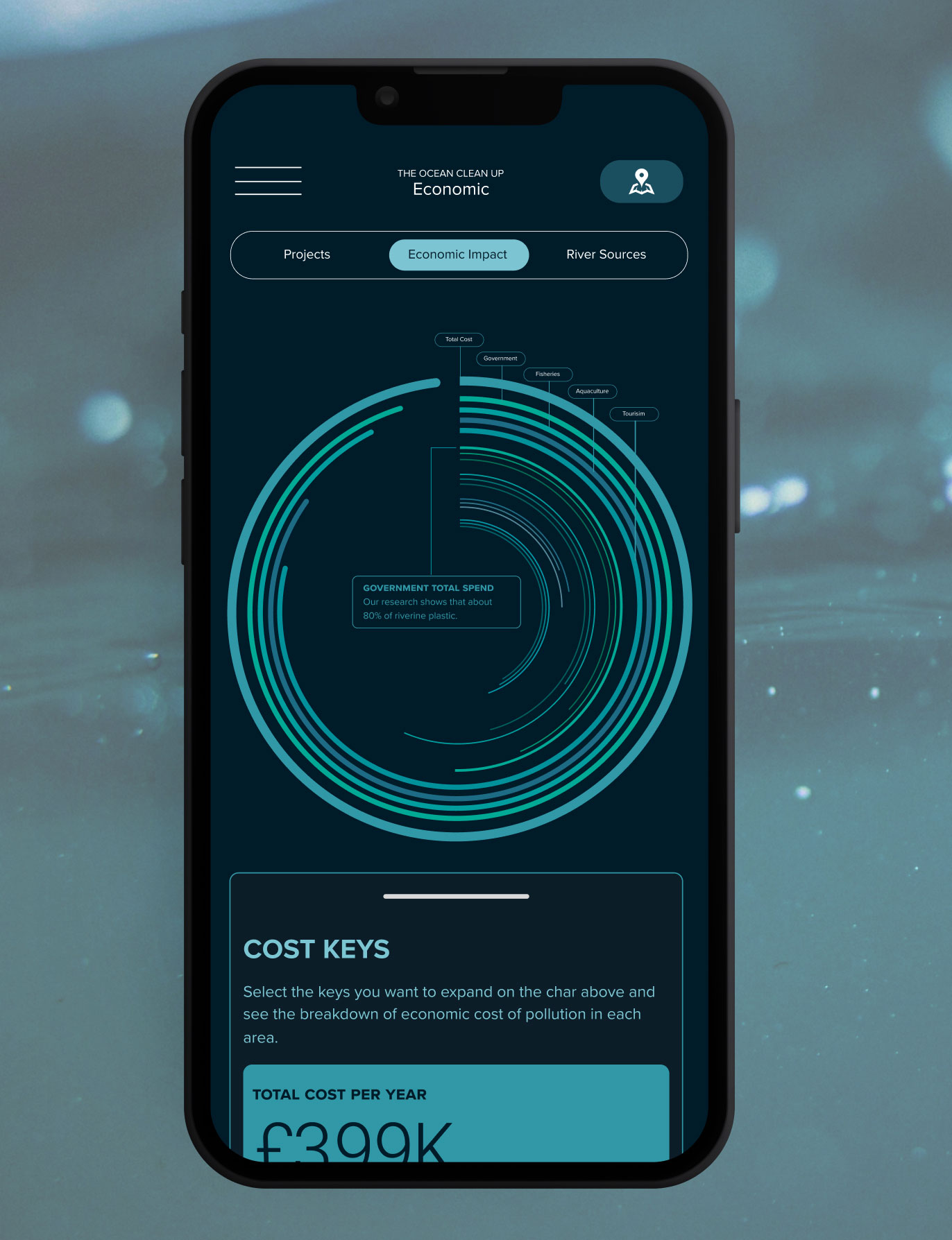
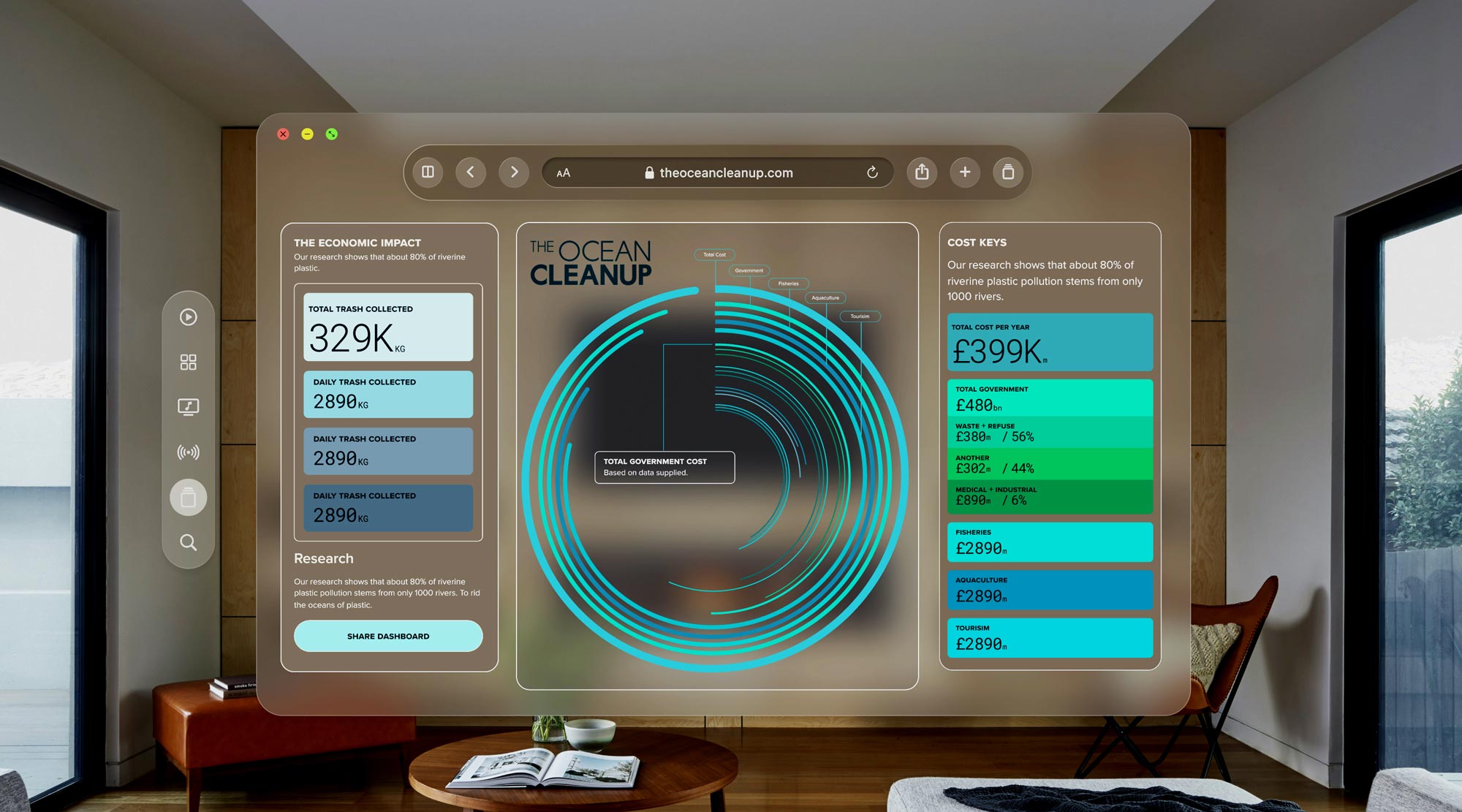
The system was drawn across desktop, mobile, and — because a live map of the ocean's recovery belongs on a wall — a visionOS spatial panel. Same cards, same tickers, from a phone held on a beach to a window floating in your living room.